
Vol Sweep Chart
The Vol Sweep chart shows how a selected metric changes as implied volatility is swept across a range, for an underlying’s aggregated position. It draws one curve for every combination of underlying move and date selected, so the volatility response can be compared at several price levels and dates at once. Values are summed across the selected accounts.
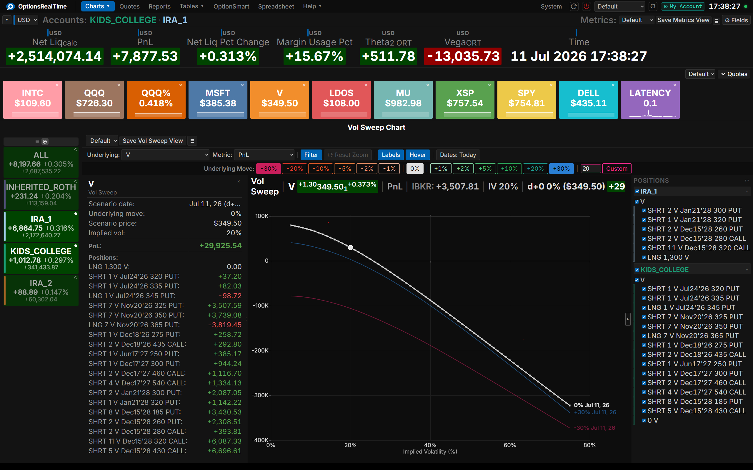
Where the Vol Scenario chart sweeps price at fixed volatility levels, the Vol Sweep chart sweeps volatility at fixed price moves. Its Dates and multi-move behavior mirror Vol Scenario Custom mode.
Toolbar
Section titled “Toolbar”- View selector: switch between saved configurations
- Save Vol Sweep View: save the current setup
- View Actions (hamburger menu): Reload, Save As, Rename, and Delete the current view. Rename and Delete are not available for the Default view.
- Underlying: pick which underlying to display
- Metric: pick the metric to chart. The choices are Delta Dlrs ORT, Delta ORT, Extrinsic Value, Gamma Dlrs ORT, Gamma ORT, PnL, PnL Unrealized, Theta Linear, Theta ORT, Theta2 ORT, Value ORT, and Vega ORT.
- Filter: show or hide the Position Filter panel on the right
- Reset Zoom: return the chart to its default range
- Labels: show or hide the label at the right end of each curve
- Dates: pick which dates to evaluate
The Controls chevron at the right of the title band hides and shows the control rows, giving the chart the full height of the page. The setting is kept per component.
Underlying move
Section titled “Underlying move”The Underlying Move chips choose which price moves to plot: -30%, -20%, -10%, -5%, -2%, -1%, 0%, +1%, +2%, +5%, +10%, +20%, and +30%. These are multi-select rather than radio buttons, so any number of them can be picked, and each selected move draws its own curve at every selected date.
At least one move has to stay on.
Custom move chip
Section titled “Custom move chip”One extra chip sits at the end of the row, showing its own value on its face, such as +7.5% or -12.25%, with a slider under it. The range is -95% to +100% in steps of 0.25.
Changing the value. There are three ways, and no typing.
The slider under the chip covers the whole range in one drag, which is the way to get close to a target quickly.
Moving the pointer onto the chip reveals a minus arrow on its left and a plus arrow on its right. Clicking an arrow moves the value one step. Holding an arrow down repeats the step, starting after about half a second and then speeding up. The arrows are the way to finish the last step or two.
Rolling the mouse wheel over the chip also moves it one step.
All three use the same step and stop at each end of the range.
Turning the chip on or off. Clicking the middle of the chip toggles it. A chip that is on is filled with its color and carries black text, and one that is off is drawn as an outline. The value is kept while the chip is off.
The custom chip counts as a move selection, so it cannot be turned off while it is the last selection left on.
Repricing waits 400 milliseconds after the last step, so clicking through a range of values sends a single request at the end. If the custom value matches a preset chip that is already on, only one curve is drawn.
Color follows value. The chip takes its color from its current value rather than carrying a fixed one. The preset moves are fixed points on that scale, so a chip sitting exactly on a preset takes that move’s color, and any value between two of them blends the pair. The preset chips, the custom chip, and the curves all read from the same scale, so a curve’s color always matches the chip that produced it. Beyond the preset row the scale keeps going rather than flattening, so a value far outside the presets still reads as more extreme than one just past them. A single step changes the color only slightly, since the color has to track the value across the whole range.
The chip works the same way as the two custom value chips in Vol Scenario Custom mode, differing only in the quantity it sets and its range.
The Dates control lists dates from today through the earliest expiration among the options in the filter. One or more can be selected, and each date draws its own set of move curves, so the chart shows how the volatility response changes as time passes.
Two of the date choices are special:
- Expiry: the expiration date, priced as if one day is left, so some time value remains.
- EOD (settle): the end of the expiration date, with no time value left.
This is the same Dates control used in Vol Scenario Custom mode.
Position Filter
Section titled “Position Filter”This chart covers one underlying at a time. Positions can be selected in the Position Filter panel on the right, toggled with the Filter button in the toolbar.
Reading the chart
Section titled “Reading the chart”The horizontal axis shows implied volatility from 5% to 75%, priced at every 1% step, which is 71 points per curve. The vertical axis shows the selected metric. A marker on each curve sits at the current market implied volatility, so the metric can be read at today’s volatility alongside how it changes as volatility rises or falls.
Each curve carries a label at its right end showing its move and its date. The Labels button hides and shows them.
Moving the pointer across the plot highlights the curve beneath it, shows that curve’s sample points, and marks the point nearest the pointer with a ring. Clicking locks the selection, and clicking empty space releases it. A selection is made when the chart first draws, so the panel is never empty.
The chart header displays the selected underlying, its price and percent change, the selected metric, the current implied volatility, and the value at the reference move.
Side Panel
Section titled “Side Panel”The left panel shows the details for the selected point: the scenario date, the underlying move, the scenario price, the implied volatility, and the value of the metric. Below that it lists each position with its contribution to the metric.
Chart Interaction
Section titled “Chart Interaction”- Left-click drag: pan
- Shift + left-click drag: draw a vertical band to zoom to that volatility range
- Mousewheel: zoom the volatility axis
- Double-click: return to the default view
- Right-click: open the menu
- Reset Zoom (in the toolbar): return the chart to 5% through 75%
The value axis refits to the visible volatility range while zooming or panning.