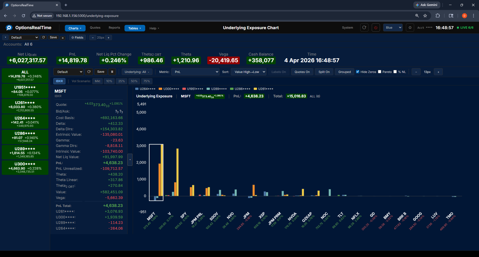
Underlying Exposure Chart
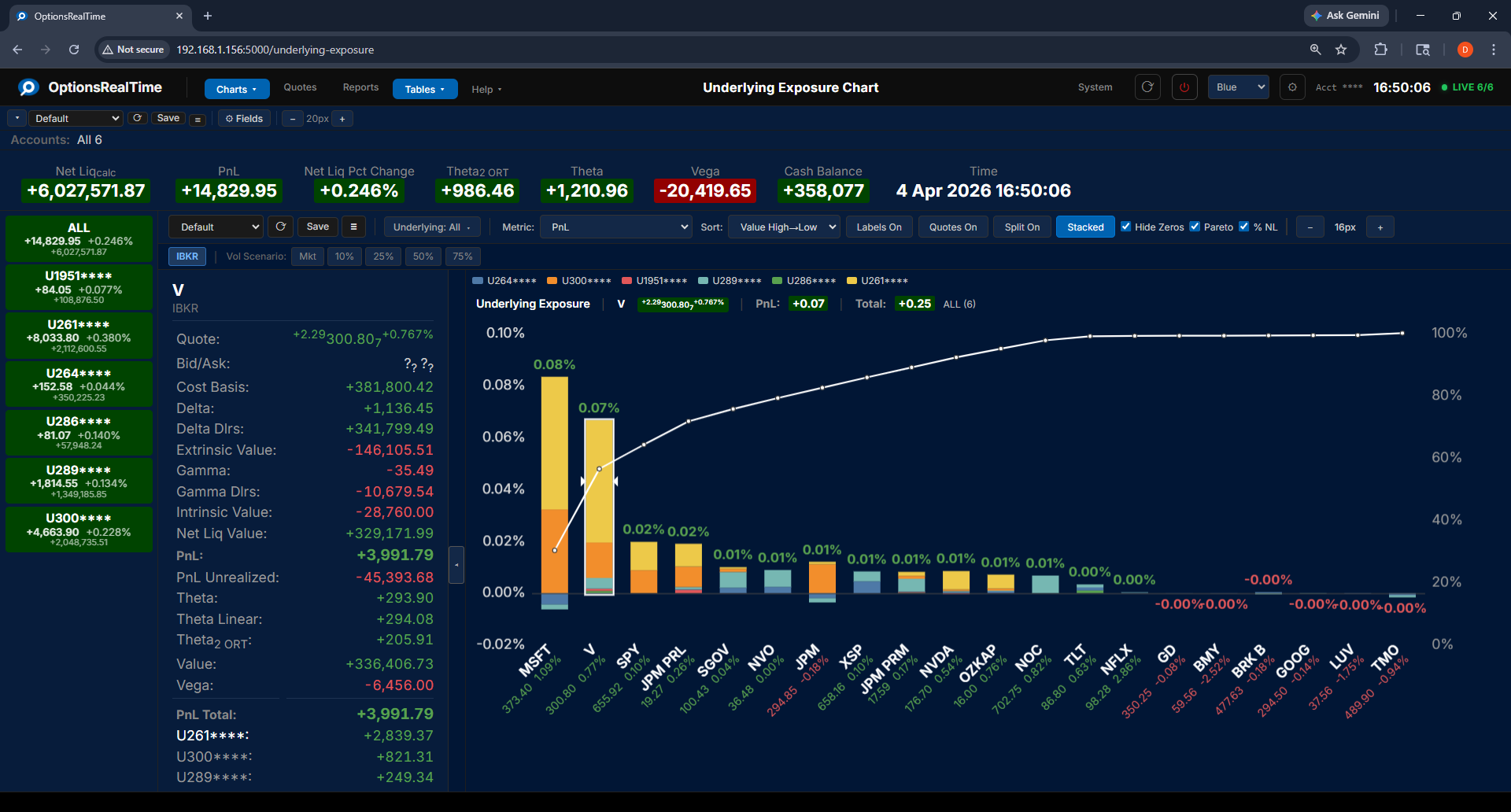
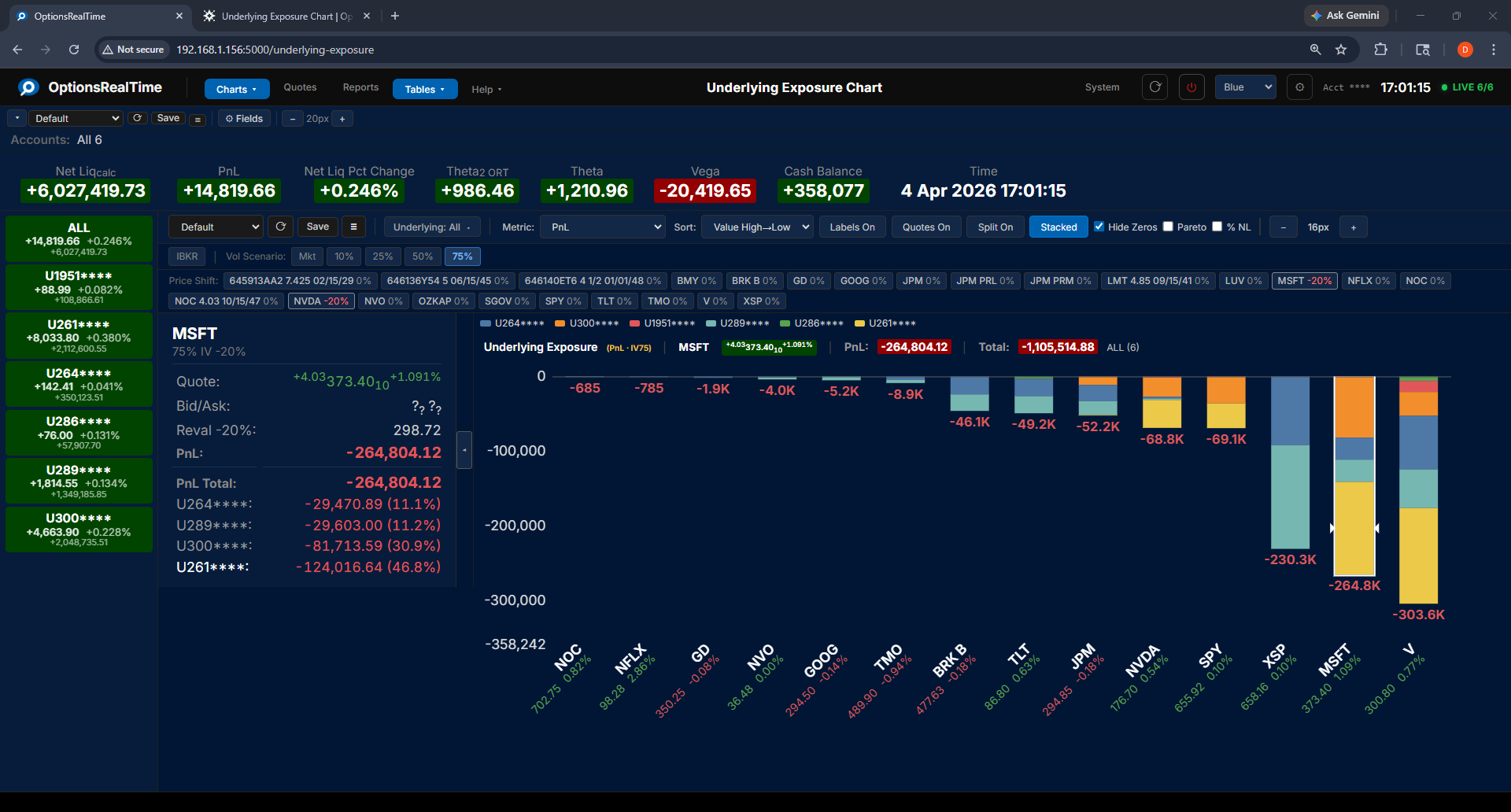
The Underlying Exposure chart shows a bar for each underlying in the portfolio, with color segments showing each account’s contribution. An account legend at the top of the chart identifies each account by color. The chart header displays the selected underlying symbol, its price change and percent change, the selected metric’s value for that underlying, the total of the metric across all underlyings, and an account-count indicator (1 of 6, 2 of 6, …, ALL (6)) showing which of the selected accounts is currently in focus or that all are aggregated.
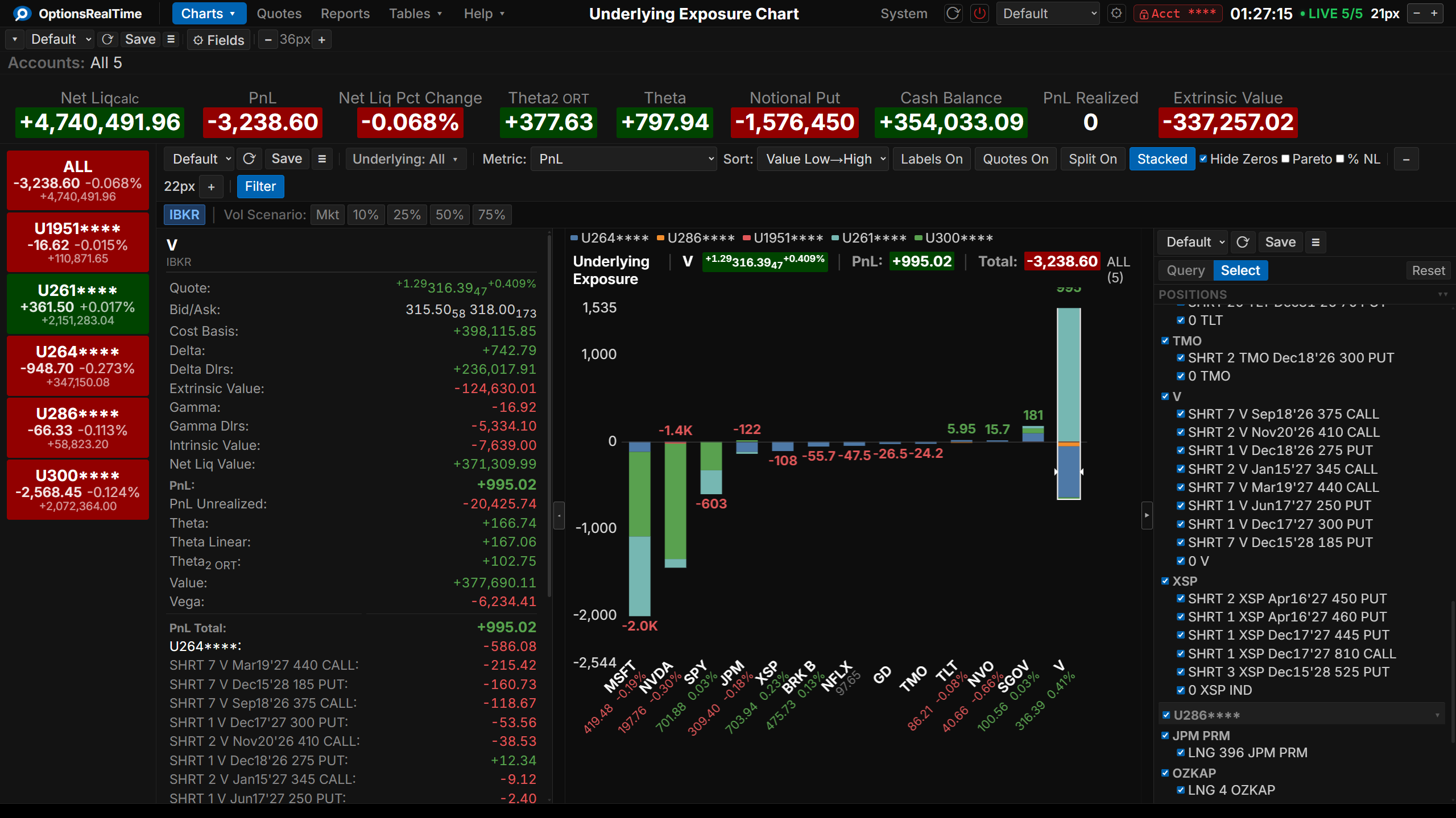
Toolbar
Section titled “Toolbar”- View selector: switch between named configurations
- Save Underlying Exposure View: save the current configuration
- View Actions (hamburger menu): Reload, Save As, Rename, and Delete the current view (Rename and Delete are unavailable for the Default view)
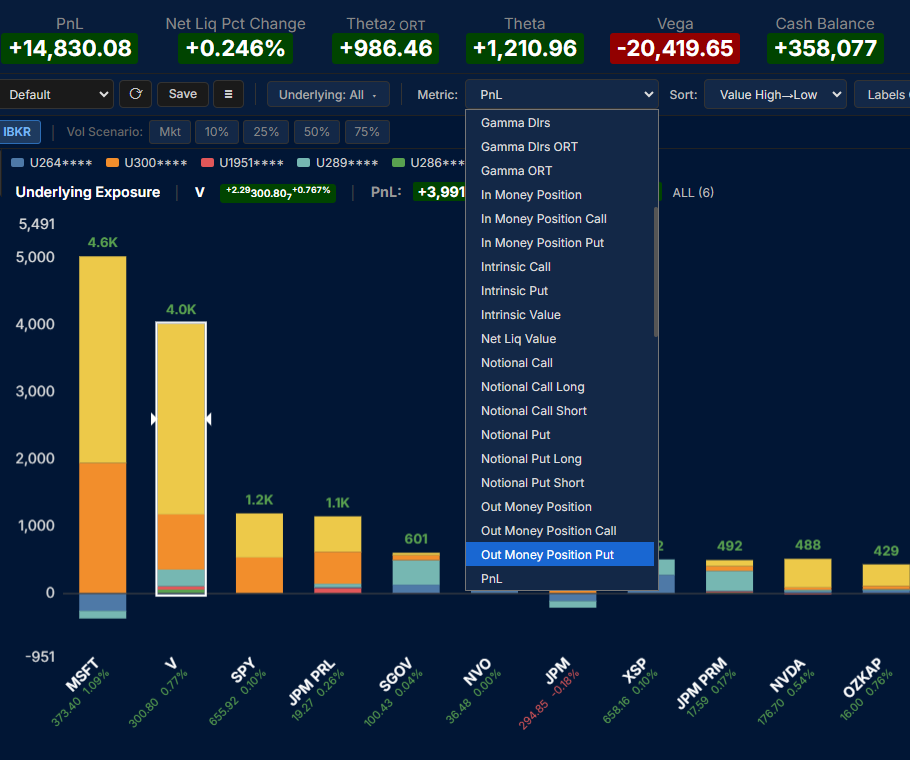
- Metric: select from 70+ metrics including PnL, Greeks, Value, Intrinsic/Extrinsic, Notional, and more
- Sort: sort bars by metric value (High to Low or Low to High) or by underlying name (A to Z or Z to A)
- Labels On: toggle value labels on each bar
- Quotes On: toggle the market quote for each underlying on the X-axis below the symbol name
- Split On: toggle account color segments within each bar on or off
- Stacked / Grouped: toggle between stacked bars (accounts layered) and grouped bars (accounts side by side)
- Hide Zeros: hide underlyings with zero values
- Pareto: overlay a cumulative percentage curve
- % NL: display values as a percentage of net liquidation
- Filter: toggle the Position Filter panel on the right side of the component
Position Filter
Section titled “Position Filter”This component supports the Position Filter, a right-side panel that narrows the view to a chosen subset of positions. A filter selector narrows the selection by any combination of underlyings, type, side, or expiry, which can then be refined in the panel.
Metrics
Section titled “Metrics”Select any metric from the dropdown to update the chart. Available metrics include Greeks (Delta, Gamma, Theta, Vega) with IBKR and ORT variants, PnL, Value, Cost Basis, Intrinsic and Extrinsic Value, Notional and contract counts, Call/Put and Long/Short breakdowns, and more.
Stacked and Grouped Views
Section titled “Stacked and Grouped Views”In Stacked mode, each bar shows account contributions layered on top of each other. In Grouped mode, each account’s bar is displayed side by side for direct comparison.
Side Panel
Section titled “Side Panel”The side panel can be opened by clicking the expand/contract tab in the center-left edge of the chart. It shows general metrics for the selected underlying, including Greeks, PnL, Value, and more. Below the general metrics is a per-account breakdown of the selected metric. Clicking a bar selects that underlying in the side panel. Clicking a specific account segment within a bar highlights that account in the side panel.
Pareto Curve
Section titled “Pareto Curve”Enable the Pareto checkbox to overlay a cumulative percentage curve on the chart, showing where risk concentrates across underlyings. Combined with % NL, values are expressed as a percentage of net liquidation.
Vol Scenario
Section titled “Vol Scenario”The Vol Scenario toolbar switches between live IBKR market data and analytical what-if modeling:
- IBKR: live market values from IBKR
- Mkt: model using current market implied volatility
- Mkt-5%, Mkt-2%, Mkt+2%, Mkt+5%: model after adding or subtracting 2 or 5 percentage points to the implied volatility solved for, across all options
- IV10%, IV25%, IV50%, IV75%: model using scenario implied volatility levels
When a Vol Scenario is active, a Price Shift row appears showing every underlying with its current price adjustment. Click the percentage label next to any underlying to select a price change from -20% to +20% (available steps: -20%, -10%, -5%, -1%, 0%, +1%, +5%, +10%, +20%). Any number of underlyings can be adjusted simultaneously. The chart updates in real time to show the projected metric value under both the IV scenario and the price moves.
The side panel and chart header display the scenario details, including the selected IV level and the revalued price for the clicked underlying. Price scenario settings are saved per underlying and persist across sessions.
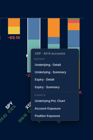
Right-Click Navigation
Section titled “Right-Click Navigation”Right-clicking any bar opens a context menu with links to related reports and charts, filtered to that underlying and the accounts selected in the account selector.