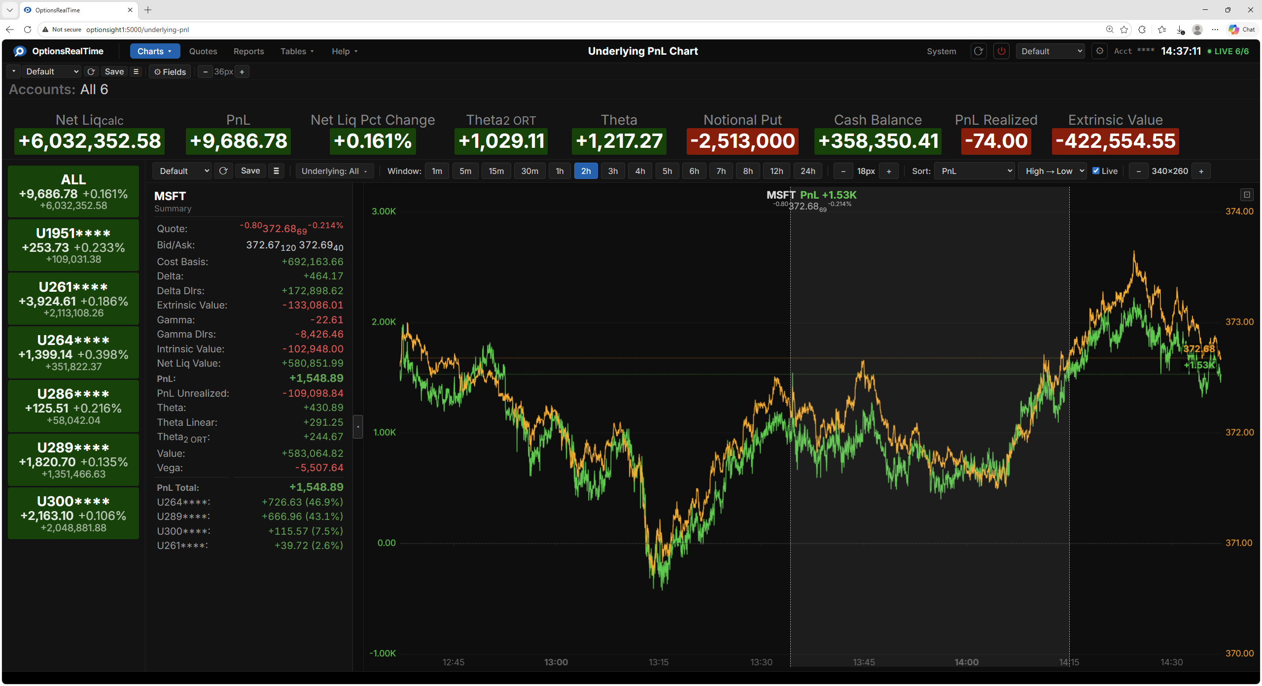
Underlying PnL Chart
The Underlying PnL Chart displays a chart for each underlying in the portfolio. Each chart plots the aggregated PnL alongside the last price of the underlying over time. PnL is shown on the left axis and last price on the right axis. A quote chip on each chart shows the last price (with last size as a subscript), change, and percent change. Values aggregate across the accounts selected in the account selector.
Charts flow in a grid and reflow as the window is resized.
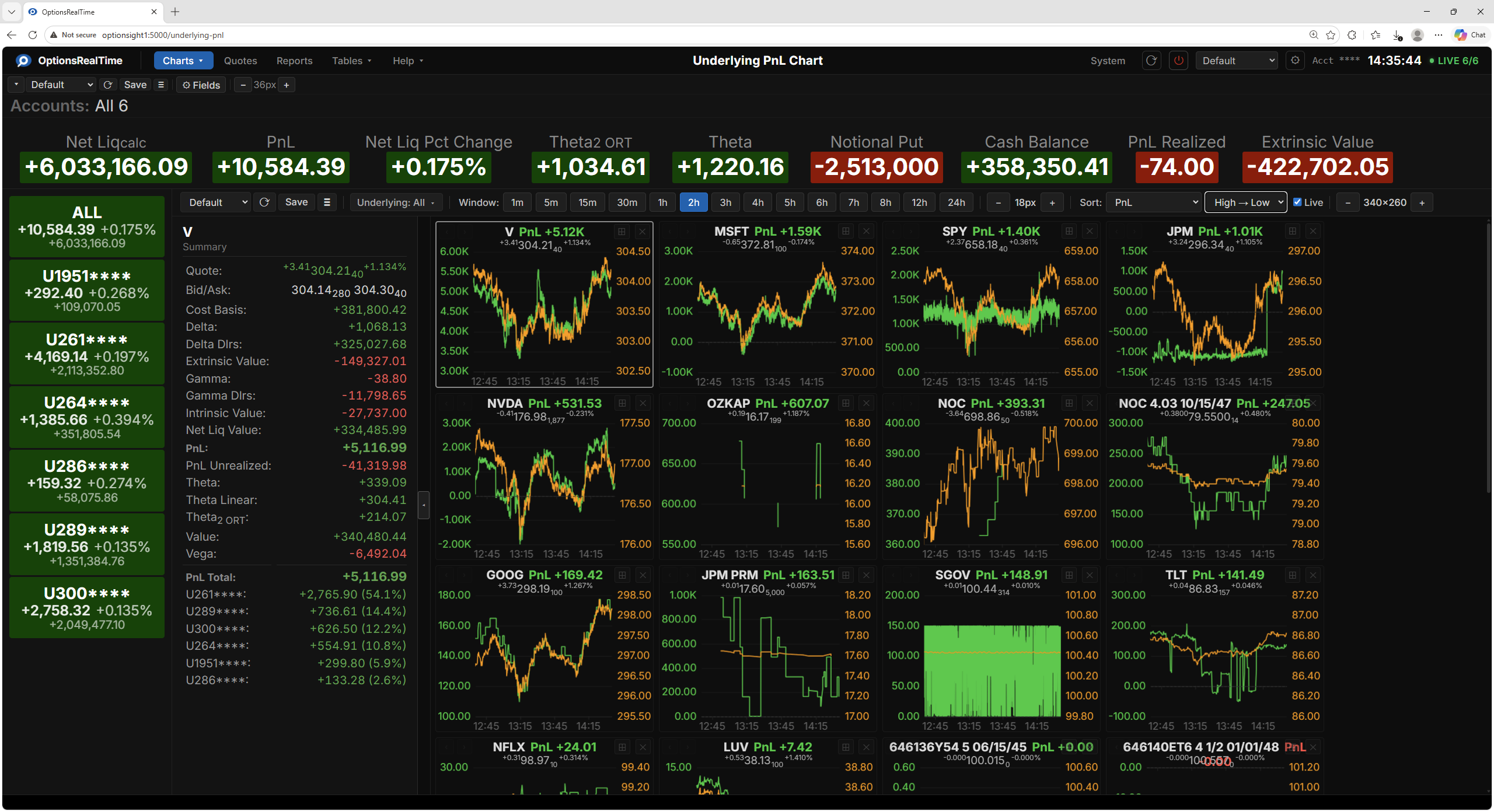
Toolbar
Section titled “Toolbar”- View selector: switch between named configurations
- Save Underlying PnL View: save the current configuration
- View Actions (hamburger menu): Reload, Save As, Rename, and Delete the current view (Rename and Delete are unavailable for the Default view)
- Underlying selector: dropdown with checkboxes to choose which underlyings to display
- Window: select the time range to display (1m, 5m, 15m, 30m, 1h, 2h, 3h, 4h, 5h, 6h, 7h, 8h, 12h, 24h)
- Sort: sort charts by any of several metrics including Change, Change %, Last, PnL, PnL (calculated from prev close), and Underlying name
- Sort direction: High to Low or Low to High
- Live: when checked, charts are continuously re-sorted as values change, disabling manual reordering
- Chart size: width and height of each chart in pixels
Chart Controls
Section titled “Chart Controls”Each chart has controls in its corners, visible on hover.
Left corner:
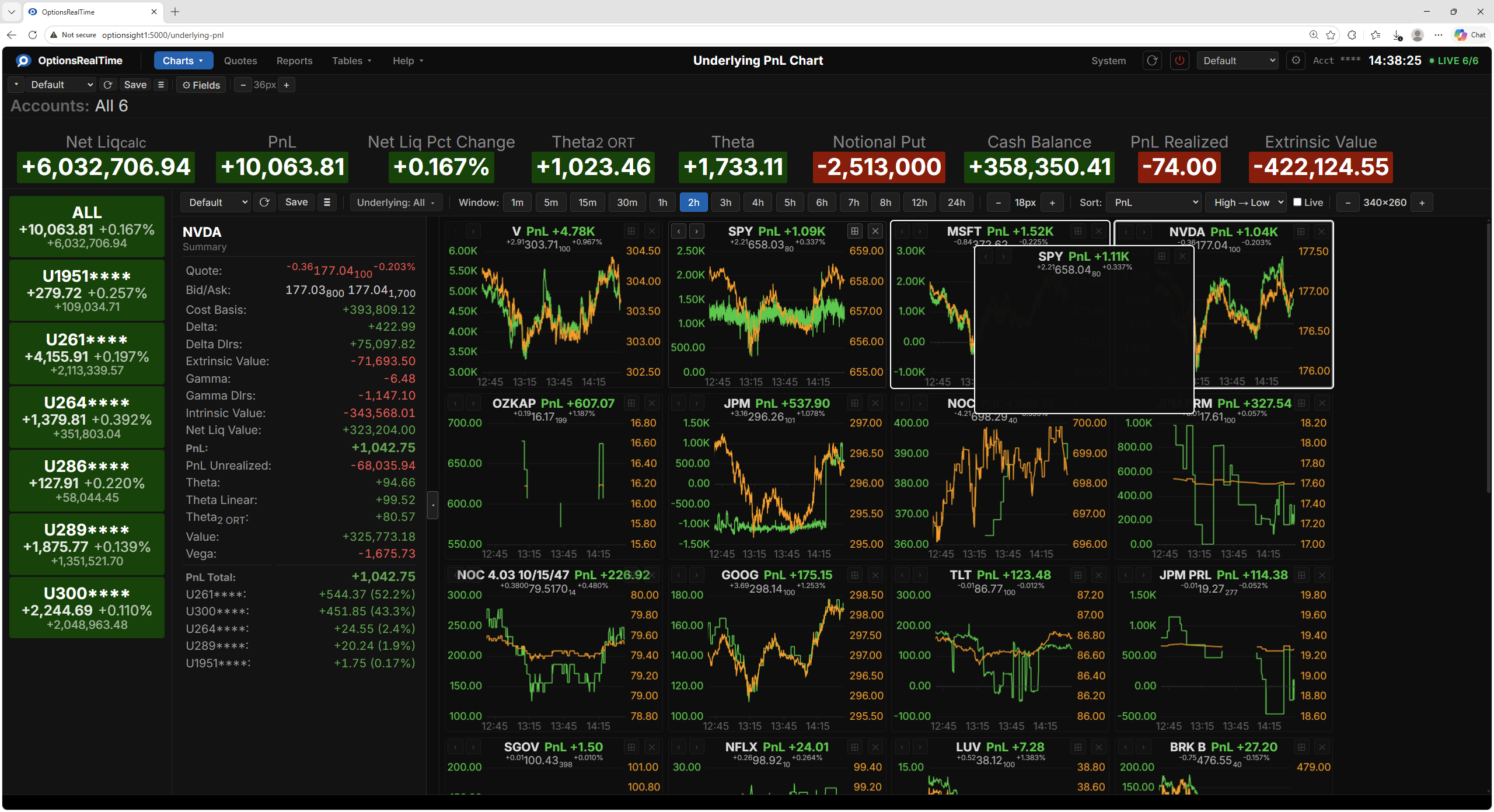
- <: send the chart to the beginning of the first row
- >: send the chart to the end of the last row
Right corner:
- Zoom: expand the chart to full screen view (see below)
- X: hide the chart
Side Panel
Section titled “Side Panel”The side panel can be opened by clicking the expand/contract tab in the center-left edge of the chart. It displays metrics for the selected underlying aggregated across the selected accounts, including the quote, Greeks, PnL, Value, Intrinsic/Extrinsic. Below the metrics is a PnL breakdown by account.
Clicking any chart selects that underlying and updates the side panel.
Drag and Drop
Section titled “Drag and Drop”When Live is unchecked, charts can be dragged to any position. While dragging, highlighted borders appear around the surrounding charts indicating where the dragged chart will be inserted. When Live is checked, the sort order is maintained automatically and manual reordering is disabled.
Full Screen View
Section titled “Full Screen View”Clicking a chart’s maximize button expands it to fill the component area, showing a single underlying. Click the Restore button in the upper right to return to the layout.
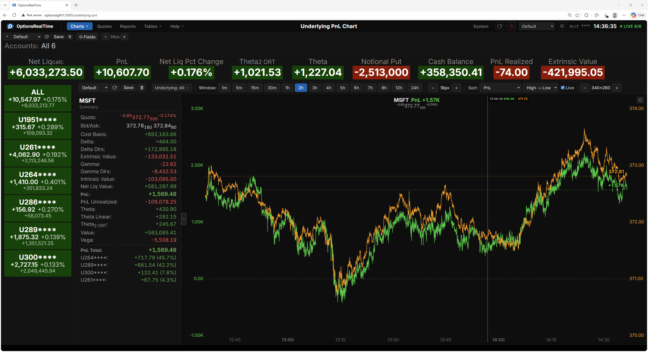
Chart Interaction
Section titled “Chart Interaction”In full screen view:
- Left-click drag: draw a zoom rectangle, release to zoom to that area
- Right-click drag: pan the chart
- Double-click: revert to default view
- Reset button (upper right of chart): revert to default view