Web UI Overview
OptionsRealTime runs in any browser on the network. A single component (chart, quotes panel, report, or table) occupies the central area. The component is surrounded by one or more rows of metrics across the top and an account selector on the left side. Both the component and metrics respond to the accounts selected.
General Layout
Section titled “General Layout”
Here is an example showing the Quotes component with all six accounts selected:
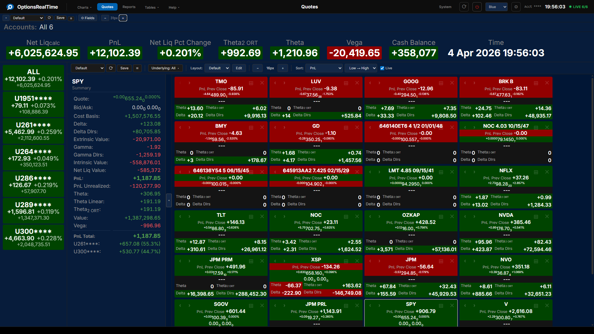
Navigation Bar
Section titled “Navigation Bar”The navigation bar runs across the top of every page. The active component is highlighted and named in the center.
The left side contains menus for navigating between components: Charts, Quotes, Reports, Tables, OptionSmart, and Help.
The right side contains the System table button, refresh button, reboot analyzers button, theme selector dropdown, settings gear, account display toggle, clock, and stale data indicator.
The account display toggle cycles through the account ID display modes (Actual, Mask, Obfuscate, Name) as a shortcut to the same control in Settings.
The theme selector dropdown switches between any named theme that has been saved.
Account Selector
Section titled “Account Selector”The Account Selector runs down the left side of every page. It shows one button per connected account, plus an ALL button at the top.
Each button shows the account ID, current PnL, percentage change, and net liquidation value, color-coded by the configured positive and negative theme colors. The account ID display follows the privacy mode selected in Settings.
Two mode buttons at the top of the selector switch between sticky (multi-select toggle) and radio (single-select) modes. The ALL button selects every connected account in either mode. Every metric, chart, quote tile, table, and report on the page updates to reflect the selection. See Account Selector for details.
The account buttons scale with the Account Sidebar font control (in Settings).
Metrics Bar
Section titled “Metrics Bar”The Metrics Bar sits between the navigation bar and the component area. It shows a row of metric tiles, each displaying a label and a live value aggregated across the selected accounts.
Tiles can be dragged to any position. A tile can be removed by clicking the X in the upper right corner of its label area. The Metrics Bar automatically expands to multiple rows as the Metrics Strip font size (in Settings) increases or more metrics are added. See Metrics for details.
Toolbar controls:
- Show/hide toggle: collapses or expands the Metrics Bar
- Currency selector: sets the currency used by the bar and the active component
- Accounts: shows the currently selected accounts
- View selector: switch between named metric configurations
- Save Metrics View: save the current configuration
- View Actions (hamburger menu): Reload, Save As, Rename, and Delete (Rename and Delete are unavailable for the Default view)
- Fields: add or remove metric tiles
Position Filter
Section titled “Position Filter”The Position Filter is a panel on the right side of the page that selects any subset or all positions across multiple accounts. The active component reflects that selection.
Toggle the panel with the Filter button in the component toolbar.
The Position Filter is available on Underlying Exposure, Account Exposure, Position Exposure, Expiry Exposure, Expiry Profile, Vol Scenario, Reports, and Tables. See Position Filter for details.
Component Area
Section titled “Component Area”The component area fills the rest of the screen. Navigate to any component using the menus in the navigation bar.
Each component has its own toolbar with a view selector, view actions menu, save button, font size control (where applicable), and component-specific controls such as column selection, chart modes, and filters.
Component views are saved by name and persist across sessions. All browsers share the same saved views, including component, theme, and metrics configurations.
Right-Click Navigation
Section titled “Right-Click Navigation”Right-clicking on any bar, row, or position in any component opens a context menu with links to other components. The destination loads filtered to the selection. The available options depend on the component and the item selected.
Status Bar
Section titled “Status Bar”The status bar runs along the bottom of every page. It displays confirmations and feedback for actions such as saving, creating, or deleting views (e.g., Saved "Default", Created "ABC", Deleted "MAIN").
Font Sizes
Section titled “Font Sizes”Font sizes are controlled in the Settings dialog. Six UI areas can be sized independently:
- Buttons & Controls
- Metrics Strip
- Account Sidebar
- Side Panels
- Chart Titles
- Chart Axes
A few components have an additional font-size control in their toolbar:
- Tables: table text
- Reports: report text
- Quotes: quote tiles
- OptionSmart: output text
Settings
Section titled “Settings”The gear icon in the navigation bar opens the Settings dialog for theme, privacy, and global configuration. See Settings for details.
Save and Load
Section titled “Save and Load”Saving works the same way throughout the platform:
- Metrics Bar: save named metric configurations
- Themes: save named color and font themes
- Components: save named views for each component
All browsers share the same saved views, including component, theme, and metrics configurations.
Components
Section titled “Components”Charts
Section titled “Charts”| Component | Description |
|---|---|
| Underlying Exposure | Greeks and metrics by underlying across accounts, with scenario modeling |
| Account Exposure | Exposure viewed by account or by underlying |
| Position Exposure | Every position mapped by risk, colorized by yield |
| Expiry Exposure | A selected metric for one underlying, aggregated by expiration date, colorized by yield |
| Expiry Profile | Risk and metrics distributed across expiration dates |
| Portfolio PnL | Portfolio net liq and PnL through the trading day |
| Underlying PnL | Live PnL and price charts per underlying |
| Vol Scenario | Portfolio response to price and volatility moves |
Quotes
Section titled “Quotes”| Component | Description |
|---|---|
| Quotes | Configurable live metric tiles per underlying |
Reports
Section titled “Reports”| Component | Description |
|---|---|
| Reports | Positions grouped by underlying or expiration |
OptionSmart
Section titled “OptionSmart”| Component | Description |
|---|---|
| OptionSmart | Package your live portfolio analytics into a preformatted prompt for any AI |
Tables
Section titled “Tables”| Component | Description |
|---|---|
| Tables | Position, Underlying, Portfolio, and System tables with live data |
| Component | Description |
|---|---|
| Excel | Real-time data in Excel via RTD formulas. Runs as a separate client on any machine, connects to the same data stream as the browser. |