Vol Scenario Chart
The Vol Scenario chart shows how a selected metric changes as the underlying price moves, across different implied volatility scenarios. Each curve represents a different implied volatility level (Market IV, 10%, 25%, 50%, 75%), allowing visualization of how portfolio Greeks and values respond to combined price and volatility shifts.
The X-axis shows underlying price moves of ±20%, ±15%, ±10%, ±5%, ±1%, and 0%.
Available metrics:
- Delta
- Delta Dlrs
- Extrinsic Value
- Gamma
- Gamma Dlrs
- PnL
- PnL Unrealized
- Theta
- Value
- Vega
IBKR Reference Marker
Section titled “IBKR Reference Marker”A bold cross marker labeled “IBKR” shows the actual value reported by Interactive Brokers, using the same color as the Market IV curve. This provides a real-world reference point to validate model calculations.
- For PnL and PnL Unrealized: The marker is positioned at the current underlying’s actual percent change from yesterday’s close, showing “where you are now” on the scenario curve.
- For all other metrics: The marker is positioned at 0% (no price change), providing a comparison point between IBKR’s reported value and our Market IV calculation.
The chart title displays both values for comparison: Theta V (Mkt IV) 112.02 | (IBKR) +122.76
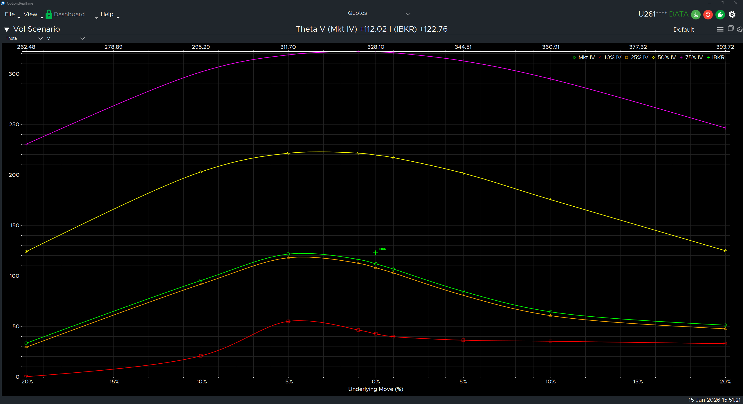
Chart Interaction
Section titled “Chart Interaction”Supports zooming and panning:
- Ctrl+Mousewheel: Zoom the chart under the cursor
- Left-click drag: Draw a zoom rectangle, release to zoom to that area
- Right-click drag: Pan the chart
- Double-click: Revert to default view
- Refresh button (upper right): Revert to default view
Display Settings
Section titled “Display Settings”In the upper right corner of the Vol Scenario Chart is a gear icon for settings.
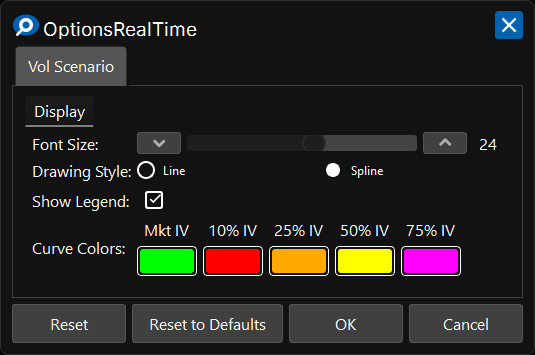
Display
Section titled “Display”- Font Size: Font size for axis labels
- Drawing Style: Line or Spline curve rendering
- Show Legend: Toggle visibility of the implied volatility legend
Curve Colors
Section titled “Curve Colors”- Mkt IV: Color for the market implied volatility curve
- 10% IV: Color for the 10% implied volatility curve
- 25% IV: Color for the 25% implied volatility curve
- 50% IV: Color for the 50% implied volatility curve
- 75% IV: Color for the 75% implied volatility curve
Control Panel
Section titled “Control Panel”In the upper left corner of the Vol Scenario Chart, next to its label, is a chevron which can be clicked to toggle the visibility of an additional control panel. The control panel contains:
- Metric Selector: Choose which metric to display (Theta, Delta, PnL, etc.)
- Underlying Selector: Choose which underlying to analyze